Highcharts in React: Toronto Food Basket App
Four months ago I visualized in my head what I wanted the Toronto Food Basket app to look like. Lots of ideas regarding design and functionalities ran through my mind. “Should I make a dashboard template or should I keep it simpler with some small functionalities at first?”. Regardless of the horizon I was looking at, one feature was always present in my ideas: a chart. If I wanted to properly show the impact of food prices I couldn’t leave out of my project such a crucial graphical representation. I believe that visual impact comes first at any circumstances, and what better than a chart to achieve that?
Back there I had no idea how I was going to implement a chart, but knowing that it would be one of the last features of my app gave me some time to research. There are some options for chart implementation, but the one that caught my attention was the HighChart library. Highchart is a popular Javascript library for creating interactive and visually appealing charts. It provides a wide range of chart types, including line charts, bar charts, pie charts, scatter plots, and more. For my application I used the ‘react-highchart’ library, which is a React wrapper for Highcharts. Other than various chart types to choose and its visual appeal, the documentation is really consistent and helped a lot to customize my charts.
I was so excited when I discovered Highcharts that I wanted to spread charts all over my application. But for the first version of the app I went ahead with a spline graph. It’s basically just a line graph with dots at the end of each x-axis item. In terms of data I wanted to show how the price per 100g behaved since I first started gathering the data. Reason for that is that in the future I want to develop functionalities even further by adding an actual basket price simulator just like the one the NNFB provides in its spreadsheet. The way it’s done is they determine the amount of food different groups need to be eating considering that they are “eating in a healthy way”. And the amount of food is measured by food per 100g.
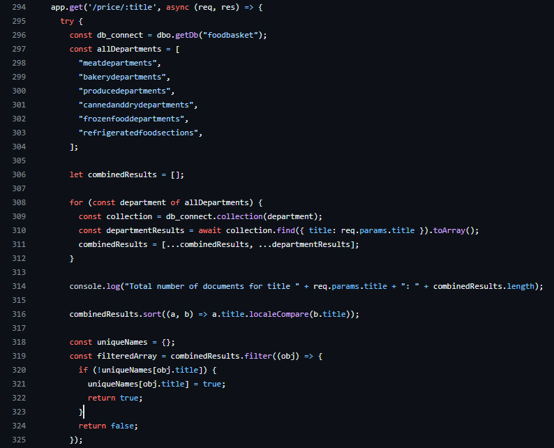
Anyways, one thing I knew beforehand was that I didn’t have a field with average prices per 100g, so I had to create one. First I’ve created a new route in my API.

Ok, a new route was created. Now I had to think about how I was going to work with the data. So I created a function that calculates the average price per 100g of a specific product for each month based on an array of products (‘allProducts’):
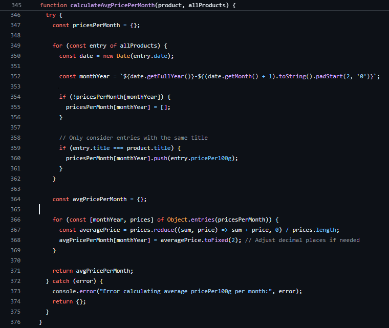
Let’s look at this function a bit closer. First I created an empty object to store all the prices per 100g for each month. Then I iterate over all products to populate the ‘pricesPerMonth’ object with the ‘pricePer100g’ information. The monthYear variable stores a string representing the month and year in the format “YYYY-MM” so the data pushed to the ‘pricesPerMonth’ object is stored in such format. Cool. So now I have all the prices per 100g stored for each product of my 65 products. What I need now is to calculate the average price. I initialize the process with another empty object called ‘avgPricePerMonth’. Then I iterate through the entries of the ‘pricesPerMonth’ object from before and calculate its average using the reduce method.
Why did I use reduce? Well. I needed to reduce all of my ‘pricePer100g’ stored inside the ‘pricesPerMonth’ object to a single value. What reduce does is it iterates over each element of my array and applies a call back function to accumulate the result. The reduce method can take up to four arguments: accumulator, current element, current index and the array itself. In my case I would need the total sum (accumulator) and the value used to get to the total sum (current value). As it iterates through the elements and calculates the average price it also stores the calculated average price for a specific month in the ‘avgPricePerMonth’ object, rounded to two decimal places.The key for the entry in the object is the ‘monthYear’. This process is repeated for each month in the loop, populating the ‘avgPricePerMonth’ object with average prices for each corresponding month.
Now back to my api route. I had to add a new field to my products that would store the average prices for each month. Using the map method I created a new array of objects called ‘resultWithAvgPricePerMonth’ where each element is an object derived from the corresponding element in ‘filteredArray’. Here my well known ‘calculateAvgPricePerMont()’ function takes over the show, and its results are added to a new property called ‘avgPricePerMonth’ in the ‘resultWithAvgPricePerMonth’ object. I made use of the spread operator to copy the existing properties.. In fact I didn’t need to copy all the properties, only the titles. Anyways, I’ll fix it later. That’s it, now my route renders the products with a brand new property: ‘avgPricePerMonth’, This is the product I’m going to use, along with the title, to populate my Highchart.
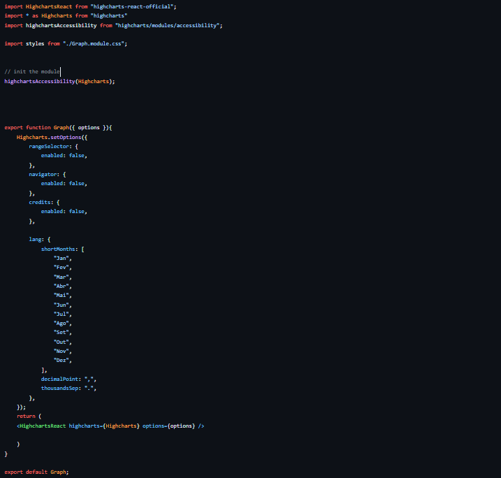
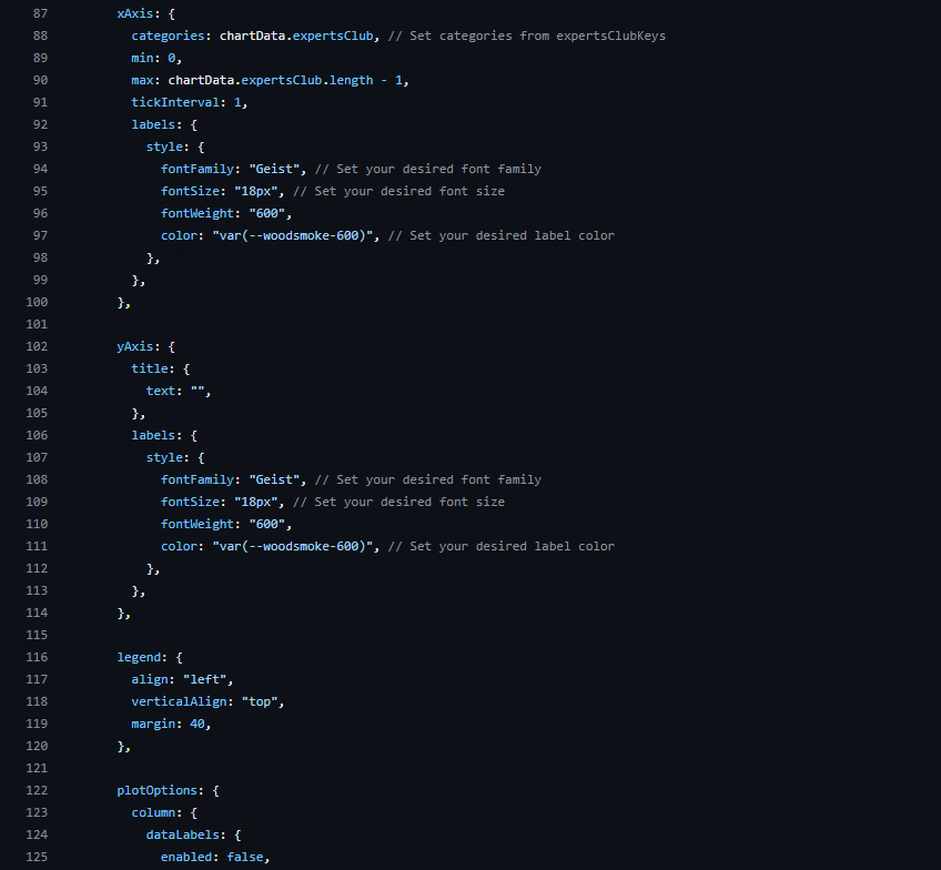
With the data organized I can go ahead and work on the chart. And here was the easiest part of the whole task. This is the thing with Highcharts: once you have your data organized and ready, setting up the chart is very easy. First I created a component that act as the main instance of my charts.So in the future if I want to add more charts to my application all I need to do is import this component and add its options - in Highcharts is what will differentiate one chart from another: title,styles, type, legends, plotOptions, among others.
The chart I wanted to use is the one that will render the data I’ve organized previously: the average price per 100g for each month. To do so I created another component called Monthly100.jsx. First, this component will fetch the information from my API and dynamically display it in my chart. Then I’m going to “throw” this data inside my chart. It seems easy, and it really is. One issue is worth mentioning thought: Highchart accepts only numbers as values. Remember my monthYear variable from before? Well, it was stored as a string. It took me sometime to realized that to be honest, but once I figured all I had to do was convert the values and keys from the ‘avgPricePerMonth’ to an array of numeric values.
In conclusion, the integration of Highcharts into the Toronto Food Basket app has not only added a visually compelling dimension to the project but has also allowed for insightful data representation. From the initial visualization of app design to the implementation of a spline graph showcasing average prices per 100g over time, the journey has been both challenging and rewarding. This chart was one of the backbones of this project. I’m extremly proud of how it worked out.. The journey may have started with a vision, but with Highcharts, it has transformed into a dynamic and data-rich reality.